Published on: 04/01/2022 • 6 min read
Avidian Report – Should You Be Concerned About an Inverted Yield Curve?
INSIDE THIS EDITION
Should You Be Concerned About an Inverted Yield Curve?
Investors need to be paying attention a lot right now as they make decisions about their portfolios. We have seen geopolitics developments with wide implications for the last two months and are now seeing energy policy shifts like a significant release from the strategic petroleum reserve that could influence the trajectory of inflation, interest rates, and asset prices. We have covered a number of these variables in some detail over the last several weeks.
Another critical data point that investors should be watching closely is the yield curve. This week we see concerns over a yield curve inversion begin to hit mainstream media, perhaps for a good reason. After all, the yield curve has historically been a decent leading indicator of future economic activity.
Before discussing the yield curve, let’s look at the 2-year yield. The chart below shows that we currently have the 2-year yield retesting some key resistance levels. This has occurred many times before, and as history shows, it has often coincided with some significant market events. Take, for example, the four events shown in the chart below — the double-dip recession in the early 80s, the tech bust in the early 2000s, the housing bust in 2007, and the fourth quarter equity market meltdown we experienced in 2018. Each of these instances included sell-off inequities.
It is no wonder some investors are starting to worry again as we once again bump against resistance. Could something ominous be around the corner?

As is usually the case in financial markets, the answer is uncertain and complex. However, this is where the yield curve might lend some clues.
When we talk about the yield curve, we are talking about a line that shows yields of bonds having similar quality characteristics but with different maturity dates. When the line is plotted, an investor can visually see how the bond market may expect interest rates to change and provides some guideposts into future economic activity. Often the yield curve subtracts the yield on a 2-year treasury from the yield on a longer-dated 10-year treasury to determine a spread.
Today, the yield curve looks like the chart below. There are three shapes that the yield curve can take, and each delivers a different message to investors. For example, you could have a normal or upward sloping curve, as at the beginning of 2021, a flat yield curve, or an inverted yield curve.
As you can see, the spread has narrowed considerably since early 2021, and today, we see a curve showing signs of a future recession as it inverts.
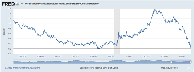
Source: St Louis Fed
This might worry some investors, but inversions don’t always predict a recession. That’s one good piece of news for investors. However, another thing to note is that usually, inversions happen well ahead of a recession. For example, since 1978, we have had seven instances when the yield curve has inverted. In each of those cases, the average time between the inversion and a recession has been 16 months. That’s nearly a year and a half. And if we look for outliers, the shortest period after an inversion where we saw recession was six months, while the longest period was 24 months.
Again, the yield curve should be used by investors as a clue to pay attention to rather than to exit in panic.
Of course, when we see interest rate changes, it can influence consumer sentiment as consumers’ buying behavior is changed by more expensive credit. On this measure, today, we don’t see consumer sentiment affected as much as it has in the past. Perhaps it is the wave of stimulus or the belief in the Fed put. Regardless, we see the consumer sentiment gap signaling more room for the yield curve inversion to progress further.
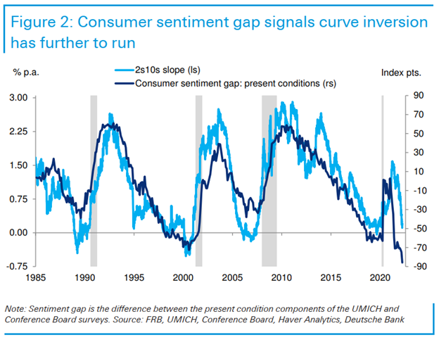
This is one reason why many investors don’t believe the current curve inversion is like the last seven. There is a historical precedent for paying attention, but there is a reluctance to accept that recession is in the cards.
Source: Twitter: @IvantheK
And perhaps, it doesn’t matter too much right now. Inversions, even when reflective of a future recession, still allow time for investors to make some money from stocks.
A case may be made that the yield curve inversion may be short- to intermediate-term bullish for stocks, as the chart below shows. In the 1980s, when we had an inversion, the bull market did not peak until mid-July 1990. During that period, the S&P 500 saw a 33.2% return. And that’s not even the best post-inversion stock market performance during the last 20 to 25 years. That can be found in the May 1998 yield curve inversion just ahead of the bull market peak associated with the dot-com craze. During that period, which lasted nearly a full two years, the S&P 500 saw a return of almost 40% after the inversion.

While the yield curve inversion might receive headline attention over the last week, investors should take it as only one data point that should be part of a mosaic of data used to make decisions. Variables over time can change, have different correlations, and lead to different results. As investors, we must keep our eyes open for inflections in data and sentiment and always maintain a sound risk management discipline. This approach ultimately yields the best results over long investment time horizons.

Disclosure:
Avidian Wealth Solutions is a registered investment adviser. The information presented is for educational purposes only and does not intend to make an offer or solicitation for the sale or purchase of any specific securities, investments, or investment strategies. Investments involve risk and, unless otherwise stated, are not guaranteed. Be sure to first consult with a qualified financial adviser and/or tax professional before implementing any strategy discussed herein. Past performance is not indicative of future performance.
Avidian Wealth Solutions may discuss and display, charts, graphs, and formulas that are not intended to be used by themselves to determine which securities to buy or sell, or when to buy or sell them. Such charts and graphs offer limited information and should not be used on their own to make investment decisions.
Please read important disclosures here
Get Avidian's free market report in your inbox

Schedule a conversation
Curious about where you stand today? Schedule a meeting with our team and put your portfolio to the test.*